Nursery Décor: Play with Colours, Themes and Patterns from Posters
When preparing for the arrival of a newborn, parents have a lot of plans and expenses to carry out. One of them is, of course, furnishing the nursery. While there’s been an ongoing debate whether babies should share the room with parents, or even co-sleep in the same bed, having a nursery is undoubtedly on the wishlist of many parents-to-be because of the benefits it provides.
If you care about creating a safe sleeping environment, you’re probably intending to purchase more than a cosy bassinet, a crib and a suitable mattress, a newborn cosy nest, a sleeping bag or a swaddle, including low VOC carpet, other furnishings such as changing table and curtains, and accessories on your must-have list. As the list grows bigger, you find yourself wondering where you’d store all the baby supplies, in the likes of blankets, diapers, creams, and lotions.
This is where the nursery comes in handy. In addition to offering the required storage space for all the baby knick-knacks, it’s ideal for encouraging a child’s independence and avoiding child separation anxiety which further has more benefits in life.
Not to mention, such a room is most helpful when the kids grow older, and carries with it a decorating role. Best of all is it won’t break your bank to transition from nursery to kids’ room with the right solutions, in the form of wall décor like the joyful nursery posters on the market.
What’s Not to Love About Posters?

They’re just the kind of artwork anyone could wish for because they’re versatile. And when I say versatile I truly mean it – there are all sorts of posters available in a wide range of colours, patterns and themes. Whichever you choose as your main one for the nursery, there’s the ideal poster to accompany it.
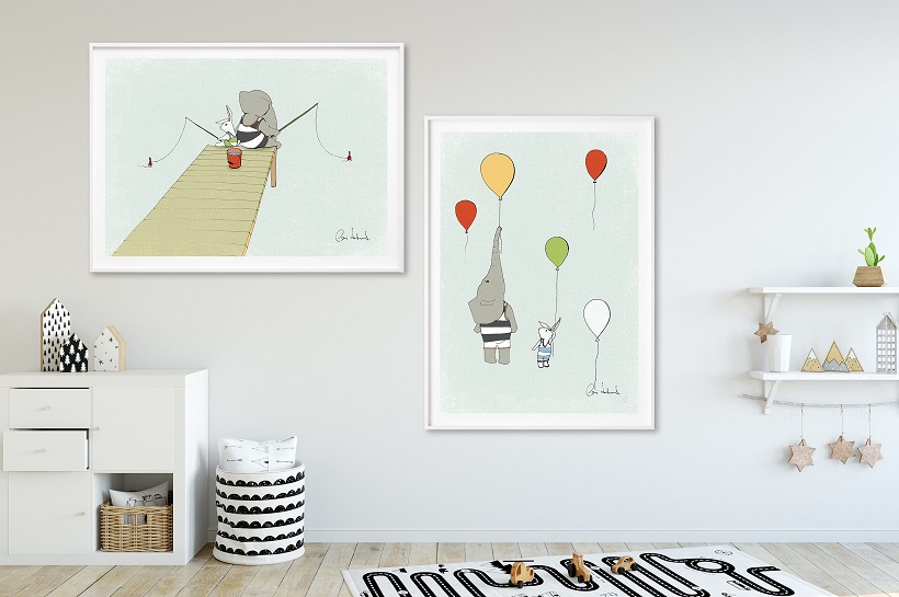
In addition, they can also be found in various shapes, and you have the chance to use them with or without frames as you see fit. Personally, I prefer them with the frames since they bring about decorating interest too, and you can use their colours and materials as elements you can coordinate with other furnishings.
Lastly, the reason why I love baby colourful room posters (and I’m sure most parents do) is the affordable price as opposed to other decorating pieces. Once toddlers grow up to be school kids, then teenagers, the room can easily grow with them solely with the help of wall décor. You can thank me later for saving you lots of money going down the drain on purchases and upgrades.
How to Pull Off the Best Result?

As soon as you start searching for posters for your bub’s nursery, you come to understand how vast the selection exactly is at the stores. Hence, it’s important to decide on some crucial aspects before the purchase.
Choose the Perfect Place for the Posters
Some parents love accent walls for that room statement, others prefer to have their fancy nursery posters all over the walls. And there are those parents who like to spice it up by not even hanging them at all. Which of the three are you?
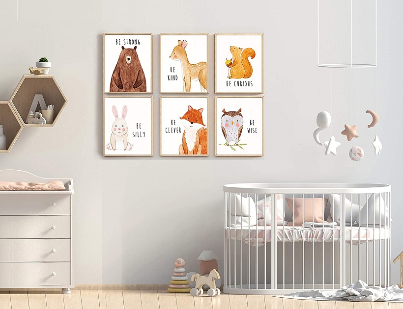
Personally, I’ve implemented a bit of the three options, starting off with the gallery wall, moving on to adding them all around the nursery, and ending up placing them on the shelves above the changing table. Each offers particular interest for the interior, though if you’re after a bigger and more artistic impact it’s got to be the accent wall.
Of the three, the third option I find to be the most subtle. It’s also very functional and there’s no such thing as too many functional pieces in the nursery!
Choose the Theme
In order to avoid getting a visual mess, and stress out your little one with different wall themes, different patterns that are too busy and quite the mix of everything, it’s advisable to select the one theme and work from there. Don’t think of it as a limitation but rather as a guiding point about what you should focus on out of the range of options.
If you choose forest animal nursery posters, then you can incorporate colours that remind you of the forest and team them up with the posters. In case you opt for the savanna, then the colour scheme would be different. The sea world also offers an interesting play with hues, more so considering you’ve got plenty of sea creatures to decorate the walls with.
For a vibrant outcome, feel free to choose posters in varying sizes, and do pick out a focal point that would draw most of the attention in the room. Since the crib is the one that mostly tops up for this role, much like the bed in the parents’ bedroom, you could work on the surrounding wall when adding the themes.
If, like me, you’re afraid for your bub’s safety, then the changing table wall would do. Once your child grows out of the “theme” phase, you could use the same colours, only substituting the baby posters with those containing inspirational quotes. You see, it’s that easy and affordable to transform the room!


